Sunday, December 23, 2012

Entron the Everlasting--a Kirby Tribute

A Jack Kirby tribute with Dominic Vivona on art. I did the colors and lettering. Not sure how Kirby-esque it is, but I still like it.


Friday, December 21, 2012

Vic Boone Sea of Trouble

I know a lot of you probably missed out on this story. It was part of the FUBAR/215 Ink FCBD offering this year. Enjoy. Written by Me. Art by Jason Copland. Letters by Jeff McClelland.


Merry Xmas and Happy Boone Year

If you haven't read it. Here it is.Vic Boone #1

Wednesday, December 19, 2012

I'll be a Special Guest at next year's Stumptown Comicfest

I can officially announce that I'll be one of the special guests at next year's Stumptown Comicfest. The guest list is a collection of some of the best comic talent around. In fact, I'm probably the least talented person on the list.
http://www.stumptowncomics.com/

Tuesday, December 18, 2012

Test trailer from the upcoming "comic of the year" Gaucho--girl meets bear meets KGB

Thursday, October 18, 2012

Poe in Panels

This is a little something I'm doing on the side. The approach is to take Poe's work and condense it down to six panels. Tough task, but I have some talented artists to help out.

Poe in Panels

Thursday, June 28, 2012

Artist Spotlight #1: Jeff Winstead Part 2

First, I'm sorry for the irregularity of my posts. Silas has started standing by grabbing things and pulling himself up, this includes my pants legs. It's rather difficult to write with a 10 month old holding on to your pants.


Now to continue on with the talent that is known as Jeff Winstead. As I pointed out in my last post, the overall appeal of Jeff's art to me is his sense of design. This comes through in his pages, character designs, logos, etc. His designs have a sense of familiarity without looking generic. Case in point is the Vic Boone logo.
He actually has an entire post about the approach he took in it's design. Found here. It's worth a read.

What I appreciate about this design is it fits the feel of Vic Boone so well. It says "pulp" without looking overly forced or a knockoff. As an aside, it was pretty clever of Winstead to ensure himself of a cut of all Vic Boone related material by designing this. Kidding, Jeff.

Other examples of his logo design work can be found here and here. The first link is to the logo he designed for the Strange Fiction anthology. He goes into the process for designing it. Again, worth a read. The second is the logo for his own creator-owned series, The Alternate.


Let's call the Strange Fiction logo a distant cousin to the Vic Boone logo. It falls in the same realm/school as Vic Boone, but still manages to carry its own uniqueness. He didn't just rehash what he had done on Boone's logo. Again, it's just familiar enough that your mind immediately knows what it conveys, but doesn't spur thoughts of "been there, done that."

The Alternate shows the variety in Winstead's designs. He's not a one trick pony. But it does exactly what the other examples do--convey a sense of what the work is about. For me, this logo looks like it could have easily been on the cover of a late 70s or early 80s Big Two book. It says, This is a superhero book. You can look at that logo and know what you're more than likely to get on the inside. You know what's being brought to the table, which is what any good logo should do. For me, a logo can make or break a book. Jeff understands this and it shows.

All three examples show another subtle approach that sometimes gets overlooked in logos--They work in a variety of colors. They aren't reliant on being only blue and white or whatever the case may be. They also, more importantly, work on anything. They don't just look good on a comic cover. Put them on a shirt, pin, hat, etc and they still hold up. They're still able to convey their purpose. I think some artists get hung up on making these radical designs that look great on paper but lose their weight when placed in any other environment. Jeff knows how to balance "cool design" with "needs to serve multiple mediums." He knows when to hold them, knows when to fold them.


Well, it looks like this Spotlight is getting broken up into three parts. Silas has decided his morning nap shall be only an hour long, instead of two. Next time I'll delve into Jeff's character design work.


Friday, June 15, 2012

Artist Spotlight #1: Jeff Winstead Part 1

Over the next few weeks I'm going to be doing some artist spotlights where I'll discuss comic artists I've worked with over the years. I'll get into what is about their style I like, what it was like working with them, and why you should seek out anything they do.

First up is fittingly the first artist I ever worked with Jeff Winstead. I feel it necessary to qualify that Jeff Winstead also happens to be one of my dearest friends. For the sake of professionalism, I'll attempt to not let that fact disrupt my objectivity.

Jeff, as many of you probably know, was the first artist on Vic Boone, having done the pages for Vic Boone's Zuda run. But our partnership goes a bit further back to years early in college.
 We met, oddly enough, thanks to a Spawn t-shirt. Jeff was my RA my freshmen year of college. One night I go out into the common hall to nuke something in the microwave and there's Jeff talking to one of the other dorm residents. Out of the corner of my eye I catch the glimpse of the Spawn shirt he's wearing. Being the first year of college and knowing no other comic readers, I figured it was worth hanging around long enough to ask about it. Unfortunately, this turned into a much longer wait than I had anticipated thanks to the rather long-winded other resident. Fortunately, the wait proved worth it.

To cut to the chase, it turned out that Jeff indeed read comics and wasn't wearing the Spawn shirt ironically. Can you were a Spawn shirt ironically? Anyway, not only did he read them, he drew them. It was actually something on those first pages of his artwork that sums up exactly why I love Jeff's work.

There was a Batman page he pulled out which had a bird's eye view off Batman dropping down on some criminals. His cape fulling extended in that parachute/glider move he does. This shot was dead center. Everything drawn in front of Batman was a single panel. Batman was essentially the bottom panel border. From Batman's cape extended more panels, their borders created by the ribs of the cape. Seeing how Jeff used an action pose of Batman as a way to break up panels without losing the storytelling of the page was the first moment I realized he was going to be good. To this day, he imaginative panel layouts and framing are what I love most about his work.
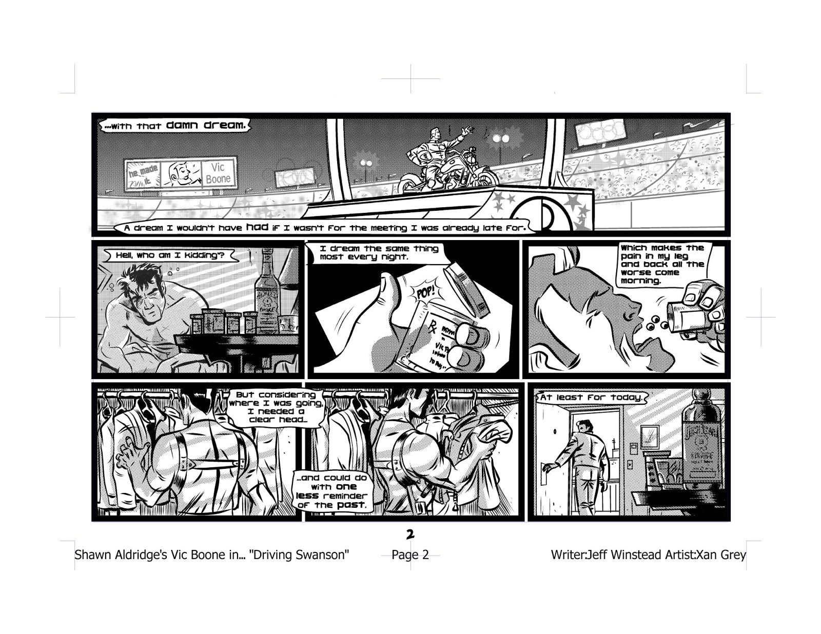
Here's a prime example from Vic Boone.
Now, Jeff usually gives me credit for this page's layout, saying it's how I wrote it in the script. That may be true, but he's execution is still what sells it. The arcing of the bottom of the panels and then using that space for the title credits is all his genius, not mine.
Here's another example.
It's a creative non-intrusive way to draw what was essentially written as "Vic Boone jumps for his guns." It's one background framed to create three distinct actions. It even creates the illusion of the Boone jumping toward the reader, yet it still moves the reader's eyes in the direction they're supposed to move.

The above examples of course fall under a bigger aspect of Jeff's artwork which is a great sense of design not just for pages, but for characters, logos, etc. He has a great sense of balance between looking original, familiar, creative, and reserved.

I'll get more into that aspect of his work in the next installment. Silas just woke up from his nap, so I have to transform into Dad Mode.


Thursday, June 14, 2012

A Brief History of Color or This $#@*! Makes My Eyes Bleed

 There's usually two schools of thought when it comes to the color style I used on Vic Boone. Some love it, others hate it. But both sides always seem to ask, "How did you decide on that style?"

Truth be told, it wasn't originally supposed to be in that style. There were actually two other styles that came before. Both radically different than the final style, though pieces of each found their way into what would be come Vic Boone's color scheme.

 The first plan was to do it in a realistic style, but using the palette of 50s and 60s comics. Simplistic without being overly rendered, not overly filtered. Unfortunately, I never seemed to quite get the handle on it like I had hoped. It came off a little too gimmicky and generic for my tastes.

 The second plan was to mimic the colors on Steranko's Nick Fury run. A 60s pop art approach was what I had hoped to accomplish. I felt that approach would work well with Boone and help sell the throwback theme I was looking for in Boone. It worked to an extent, but didn't seem to suit Geoffo's art as well as it should have.

 Stuck, Geoffo and I began what would turn out to be weeks of back and forth. He suggested we reduce the colors to only three or four a page. Simplify it, which he felt best suited his art style. Now as to what those colors would be was up to me. This search for the right colors would become a full time job on to itself. Luckily, I know some fantastic artists and it was a suggestion from one of them that final broke the wall down.

 Knowing I was struggling to find the right colors and colors that worked together, Jeff Winstead suggested I pick up a book called The Designer's Guide to Color Combinations. I cannot stress enough what a valuable tool this has turned out to be. I would highly recommend it to anyone. The book is arranged by time period with color combinations related to those specific periods of time. Each example is accompanied by the CMYK formulas for the colors used.

 I'd spend the next week or so doing trial and error tests palettes. Some would only half work, say the red was nice, but the blue was too dark. Finally I decide the best approach was to find one color that I really liked then just build the palette out from it. So, what was that color? It was a green used on a 1927 sheet music cover for (When It's) Darkness on the Delta. Specifically, the green is 50/10/50/15 in CMYK.
From that green I built what would be the palette for Vic Boone. What's funny is that green is probably the least used color in Vic Boone. It was the blue that spun out from it that has become the default Vic Boone color.

 So, there you have it-a brief and uninteresting history of the colors for Vic Boone. Now the question is, Do I continue to use this palette on Vic Boone or change it according to artist? 


Monday, June 4, 2012

FUBAR Summer Special or A Little Love for a Friend

There are very few people I respect in the small press scene more than Jeff McComsey. What he's done with the FUBAR property through hard work and dedication is a blueprint on how to get it done.

This summer he and his cohorts, in this case Chuck Dixon and Tim Truman, are releasing a summer special to hold you over until FUBAR 3 drops. It's 32 pages of zombie goodness. It's listed on page 229 under Alterna Comics. Order code JUN12 0760.


Be sure to tell your shop to order you a copy and some extra ones for when this thing blows up.

That's all for now. Coming later today, I'll go through the process that lead to Vic Boone color scheme and style.

Friday, June 1, 2012

The Script for Vic Boone #1

A few people have asked to see a sample script of mine. Here's the script for Vic Boone #1. You can download the final issue here--Vic Boone #1. You can see how much changes from the "final" script to the final version of the comic.

Enjoy!

Thursday, May 31, 2012

Two Reviews of Vic Boone

Today's post is going to be a short one. It's been a long semi-stressful day. Luckily, I came home to two positive reviews of Vic Boone which have the same effect as Calgon.

First up is a review from Aaron Duran on the Geek in the City podcast. Here's a direct link to the episode-- Vic Boone Review. The whole episode is worth a listen. The guys on Geek in the City are great, funny, and have nice voices.

The other review is from Randy Hadleman on his blog This Isn't Work. Randy compares my skills at dialoguing to Ed Brubaker and Brian Bendis. Not sure I've ever had kinder words said. Here's the review-- Vic Boone Review #2.

As always, Love, Peace, and Hair Grease.

Wednesday, May 30, 2012

The Zuda Entry that Never Was

Below are the pages for a Zuda entry which never made it in. Zuda closed up shop days after this was sent in. The idea, Japanese Demon Killers, was based on an idea the artist had come up with. He gave me the basics which I took and layered with tons of Japanese mythology and folklore. I'm not sure there's another work, before or since, for which I've done as much research.

I think the final product is ok. It has it's flaws. The writing is stiff and forced in a few places, but overall I enjoyed working in it's world. I think it had potential, though I think anything with a masked Japanese wrestler who wrestled gods has potential. Also it contains a haiku and Vincent Price. Enjoy...or not.


Tuesday, May 29, 2012

Vic Boone #1 for Free

Yep. Here's Vic Boone #1 for free. Download it, share it, love it, hate it. The Malfunction: Murder Vic Boone trade is coming out soon, so hopefully this taste will entice you to purchase it.

Vic Boone #1

Why is Savannah Greene African-American?

Why is Savannah Greene African-American?
  It's a question I'm asked more than I thought I would be. I assume most are searching for some deep meaning answer like, "I wanted to explore how society views interracial relationships." The truth is I've never viewed Savannah as anything more than a strong female character. Her race was never anything more than a salute to Pam Grier and to a few former girlfriends.


I wasn't searching for extra credit or an article to be written about how brave and forward thinking I was being by having Boone's former lover being an African-American woman. I think the moment you start hyping yourself up for having "diversity" or "exploring political/social hot topics" you devalue your comic a little. You take the focus off of the important thing--The Story. It also makes things like race, sexual preference, religion, etc come off as gimmicks, minor steps above holographic covers. Things such as that should come about because that's who the character is not because it'll get the New York Times to write an article about you.

Savannah is African-American because she always was in my mind. That's the answer.

Monday, May 28, 2012

Kid Gloves: The old idea that's new again

Another coming attraction with artist Conley Smith. This is probably my oldest idea and has gone through numerous incarnations from young adult to Vertigo style. I've settled on doing it as a young adult style graphic novel. I figured at some point I had to do something that was Silas friendly. He'll want to read something his father wrote...I hope.

The book is called Kid Gloves. It revolves around Jacob, a boy who is given gloves made from the robe of Merlin. Joining in his adventures is Alise, a faerie who is a little too concerned with fashion, and Victor, a stuffy shrunken head attached to the end of a broom stick.

Here's some preliminary sketches of Jacob and Alise by Conley. 


Sunday, May 27, 2012

Mr Zero

One of the project I'm working on now is Mr Zero. The artist is the extremely talented Jim McMunn. It'll be an original graphic novel. I plan to tell the main characters story via third person accounts and visuals. Zero has no dialogue, thought balloons, or captions. It'll be a challenge, but luckily I have a talented artist I believe can pull it off.

The Pencil and the Baby

The main purpose of this site is to discuss my writing and where it's headed or not headed. But it'll probably end up revolving around juggling this--
With this--