
Truth be told, it wasn't originally supposed to be in that style. There were actually two other styles that came before. Both radically different than the final style, though pieces of each found their way into what would be come Vic Boone's color scheme.
The first plan was to do it in a realistic style, but using the palette of 50s and 60s comics. Simplistic without being overly rendered, not overly filtered. Unfortunately, I never seemed to quite get the handle on it like I had hoped. It came off a little too gimmicky and generic for my tastes.
The second plan was to mimic the colors on Steranko's Nick Fury run. A 60s pop art approach was what I had hoped to accomplish. I felt that approach would work well with Boone and help sell the throwback theme I was looking for in Boone. It worked to an extent, but didn't seem to suit Geoffo's art as well as it should have.
Stuck, Geoffo and I began what would turn out to be weeks of back and forth. He suggested we reduce the colors to only three or four a page. Simplify it, which he felt best suited his art style. Now as to what those colors would be was up to me. This search for the right colors would become a full time job on to itself. Luckily, I know some fantastic artists and it was a suggestion from one of them that final broke the wall down.
Knowing I was struggling to find the right colors and colors that worked together, Jeff Winstead suggested I pick up a book called The Designer's Guide to Color Combinations. I cannot stress enough what a valuable tool this has turned out to be. I would highly recommend it to anyone. The book is arranged by time period with color combinations related to those specific periods of time. Each example is accompanied by the CMYK formulas for the colors used.
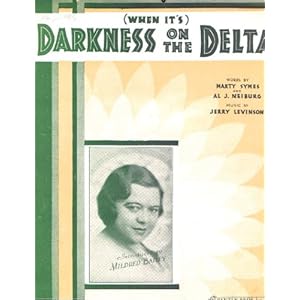
I'd spend the next week or so doing trial and error tests palettes. Some would only half work, say the red was nice, but the blue was too dark. Finally I decide the best approach was to find one color that I really liked then just build the palette out from it. So, what was that color? It was a green used on a 1927 sheet music cover for (When It's) Darkness on the Delta. Specifically, the green is 50/10/50/15 in CMYK.
From that green I built what would be the palette for Vic Boone. What's funny is that green is probably the least used color in Vic Boone. It was the blue that spun out from it that has become the default Vic Boone color.
So, there you have it-a brief and uninteresting history of the colors for Vic Boone. Now the question is, Do I continue to use this palette on Vic Boone or change it according to artist?
No comments:
Post a Comment